插件描述:Nifty Modal Window Effects是一个CSS3实现的模态框,包含多种方式弹出效果。
简介
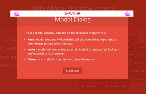
Nifty Modal Window Effects 为我们提供了多种弹出效果的模态框,通过CSS3实现。
用法
首先我们将下面元素添加到body中
1 2 3 4 5 6 7 8 9 10 11 12 13 14 15 16 17 18 | <div class="md-modal md-effect-1" id="modal-1"> <div class="md-content"> <h3>Modal Dialog</h3> <div> <p>This is a modal window. You can do the following things with it:</p> <ul> <li><strong>Read:</strong> Modal windows will probably tell you something important so don't forget to read what it says.</li> <li><strong>Look:</strong> modal windows enjoy a certain kind of attention; just look at it and appreciate its presence.</li> <li><strong>Close:</strong> click on the button below to close the modal.</li> </ul> <button class="md-close">Close me!</button> </div> </div></div> ... <div class="md-overlay"></div> |
该效果主要是通过 CSS3完成的,以下是相关的CSS代码:
1 2 3 4 5 6 7 8 9 10 11 12 13 14 15 16 17 18 19 20 21 22 23 24 25 26 27 28 29 30 31 32 33 34 35 36 37 38 39 40 41 42 43 44 45 46 47 48 49 50 51 52 53 54 55 56 57 58 59 60 61 62 63 64 65 66 67 | .md-modal { position: fixed; top: 50%; left: 50%; width: 50%; max-width: 630px; min-width: 320px; height: auto; z-index: 2000; visibility: hidden; backface-visibility: hidden; transform: translateX(-50%) translateY(-50%);} .md-show { visibility: visible;} .md-overlay { position: fixed; width: 100%; height: 100%; visibility: hidden; top: 0; left: 0; z-index: 1000; opacity: 0; background: rgba(143,27,15,0.8); transition: all 0.3s;} .md-show ~ .md-overlay { opacity: 1; visibility: visible;}.md-perspective,.md-perspective body { height: 100%; overflow: hidden;} .md-perspective body { background: #222; perspective: 600px;} .container { background: #e74c3c; min-height: 100%;}/* Effect 5: newspaper */.md-show.md-effect-5 ~ .md-overlay { background: rgba(0,127,108,0.8);} .md-effect-5 .md-content { transform: scale(0) rotate(720deg); opacity: 0; transition: all 0.5s;} .md-show.md-effect-5 .md-content { transform: scale(1) rotate(0deg); opacity: 1;} |
注意,该效果只能在现代浏览器中使用,不支持老版本的浏览器,请根据自己的需求使用。
===========以下代码由 create_time 提供===============
楼上的方法缺了,我在这里补上,如何更改,里面的颜色,component.css,里面的,.md-trigger 是通用的样式,如果要,又多样式得自己拓展。引入你下载的js文件,和css文件,里面的,default是布局样式,component.css按钮样式。
特别申明:
本站所有资源都是由网友投稿发布,或转载各大下载站,请自行检测软件的完整性!
本站所有资源仅供学习与参考,请勿用于商业用途,否则产生的一切后果将由您自己承担!
如有侵权请联系我们删除下架,联系方式:lei1294551502@163.com
- 上一个特效: 针对移动设备的手动切换插件
- 下一个特效: SVG图像生成插件triangloid