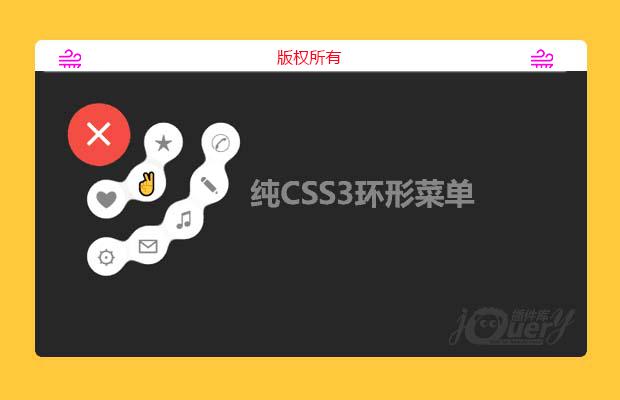
插件描述:这是一款效果非常有创意的纯CSS3液态胶合效果的环形菜单按钮特效。该环行菜单按钮在用户点击主菜单按钮后,两行子菜单会以环状的方式打开,并且子菜单就像液体一样,能够胶合,具有弹性,效果非常炫酷。
使用方法
HTML结构
在HTML结构中,主菜单按钮使用input[type='checkbox']的复选框和一个<label>元素来制作。子菜单按钮是一组<button>元素。
1 2 3 4 5 6 7 8 9 10 11 12 13 14 15 16 | <div class='wrap'> <input type='checkbox' id='checking' style='display:none;' /> <button class='blob'>★</button> <button class='blob'>?</button> <button class='blob'>?</button> <button class='blob'>?</button> <button class='blob'>?</button> <button class='blob'>?</button> <button class='blob'>?</button> <button class='blob'>?</button> <label class='blob' for='checking'> <span class='bar'></span> <span class='bar'></span> <span class='bar'></span> </label></div> |
该环形菜单的液态融合效果使用SVG过滤器来制作。在SVG过滤器中,有3个滤镜:第一个是高斯模糊滤镜,第二个是颜色矩阵滤镜,第三个是混合滤镜。混合滤镜可以将多个输入滤镜混合为一个。
1 2 3 4 5 6 7 8 9 | <svg> <defs> <filter id="filt"> <feGaussianBlur in="SourceGraphic" result="blur" stdDeviation="10" /> <feColorMatrix in="blur" mode="matrix" values="1 0 0 0 0 0 1 0 0 0 0 0 1 0 0 0 0 0 18 -7" result="filt" /> <feBlend in2="filt" in="SourceGraphic" result="mix" /> </filter> </defs></svg> |
在这个效果中,颜色矩阵滤镜的输入是高斯模糊滤镜,然后混合滤镜将颜色矩阵的输出和源图像进行混合,制作液体融合效果。
CSS样式
在CSS样式中,需要注意的是引用SVG过滤器的方式。在非webkit内核的浏览器中,外连的css样式表中引用SVG过滤器需要写完整的路径,而如果是内联的CSS样式可以直接通过ID来引用。
1 2 | filter: url("../index.html/#filt");-webkit-filter: url("#filt"); |
主菜单按钮的点击时通过checkbox hack来实现的。
1 2 3 4 5 6 7 8 9 10 11 12 13 14 15 16 17 18 19 20 21 22 23 24 25 26 27 28 29 30 31 32 33 34 35 36 37 38 39 40 41 42 43 44 45 46 47 48 49 50 51 52 53 54 55 56 57 58 59 60 61 62 63 64 65 66 67 68 69 70 71 72 73 74 75 76 77 78 79 80 81 82 83 84 85 86 87 88 89 90 | .wrap .blob[for="checking"] { z-index: 30; font-size: 60px; text-align: center; color: #fff; transition: transform 0.5s ease-in-out 0.2s; -webkit-transition: -webkit-transform 0.5s ease-in-out 0.2s; -moz-transition: transform 0.5s ease-in-out 0.2s; -o-transition: transform 0.5s ease-in-out 0.2s; -ms-transition: transform 0.5s ease-in-out 0.2s;}.wrap .blob:not([for="checking"]) { width: 50px; height: 50px; top: 15px; left: 15px; font-size: 30px; transition: all 0.5s ease-in-out; -webkit-transition: all 0.5s ease-in-out; -moz-transition: all 0.5s ease-in-out; -o-transition: all 0.5s ease-in-out; -ms-transition: all 0.5s ease-in-out;}.wrap .blob:not([for="checking"]):hover { color: #F44336; animation: harlem 0.5s linear forwards; -webkit-animation: harlem 0.5s linear forwards; -moz-animation: harlem 0.5s linear forwards; -o-animation: harlem 0.5s linear forwards; -ms-animation: harlem 0.5s linear forwards;}.wrap > #checking:checked ~ .blob:nth-child(2) { margin-left: 85px; margin-top: 10px; background-color: #fff;}.wrap > #checking:checked ~ .blob:nth-child(3) { margin-top: 145px; margin-left: 65px; background-color: #fff;}.wrap > #checking:checked ~ .blob:nth-child(4) { margin-top: 160px; margin-left: 10px; background-color: #fff;}.wrap > #checking:checked ~ .blob:nth-child(5) { margin-top: 85px; margin-left: 10px; background-color: #fff;}.wrap > #checking:checked ~ .blob:nth-child(6) { margin-top: 63px; margin-left: 63px; background-color: #fff;}.wrap > #checking:checked ~ .blob:nth-child(7) { margin-top: 65px; margin-left: 145px; background-color: #fff;}.wrap > #checking:checked ~ .blob:nth-child(8) { margin-top: 112px; margin-left: 112px; background-color: #fff;}.wrap > #checking:checked ~ .blob:nth-child(9) { margin-top: 10px; margin-left: 160px; background-color: #fff;}.wrap > #checking:checked ~ .blob[for="checking"] > .bar:nth-child(1) { transform: rotate(45deg); -webkit-transform: rotate(45deg); -moz-transform: rotate(45deg); -o-transform: rotate(45deg); -ms-transform: rotate(45deg); margin-top: 37px;}.wrap > #checking:checked ~ .blob[for="checking"] > .bar:nth-child(2) { transform: rotate(-45deg); -webkit-transform: rotate(-45deg); -moz-transform: rotate(-45deg); -o-transform: rotate(-45deg); -ms-transform: rotate(-45deg); margin-top: -10px;}.wrap > #checking:checked ~ .blob[for="checking"] > .bar:nth-child(3) { opacity: 0;} |
harlem帧动画是鼠标滑过子菜单时的CSS动画效果。完整的代码请参考下载文件。
特别申明:
本站所有资源都是由网友投稿发布,或转载各大下载站,请自行检测软件的完整性!
本站所有资源仅供学习与参考,请勿用于商业用途,否则产生的一切后果将由您自己承担!
如有侵权请联系我们删除下架,联系方式:lei1294551502@163.com
- 上一个特效: 弹幕视频(仿bilibili)
- 下一个特效: jQuery带有导航效果的图片轮播